Information is power
“The battlefield is a scene of constant chaos. The winner will be the one who controls that chaos, both his own and the enemies”
- Napoleon Bonaparte
One of the things that you notice when you play EVE is the sheer amount of information that the game throws at you. To start off with it can be a bit overwhelming. A lot of that information can be customised to suit your play style - but that can seem even more daunting. There are plenty of guides out there, many of them excellent. This is my attempt to show the steps that I have taken to manage my own chaos.
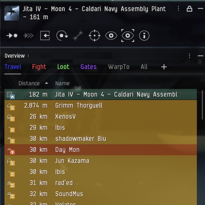
The first place to start is the overview. Out of the box, the EVE overview is useful, but bland. It does nothing particularly well. There are several overview set-ups that you can download and use. I have never used one, but apparently they are a lot better. Customising it yourself might be a bit of effort, but it does have the benefit of increasing your understanding. In my view, the overview layout that you need varies significantly depending on the role that you wish to fulfill. An ideal overview for a miner will look very different from one for a large-fleet PvPer. I'm sure my overview is far from perfect, but in this guide, I will go through my thought process in the hope it is of help for others. What I'm building is an overview for a solo pirate, but the principles should be transferable.
When I first played EVE, I had the luxury of a large, widescreen monitor. These days I play on a 13" MacBook Pro with a much smaller screen (and, sadly, poorer eysesight). The starting place for any management of chaos is screen real estate. The first tool to manage this is "Enable Compact Mode" on the dropdown for both the Overview and the Selected Item Window. The latter of these two I also reduce to two lines with smaller icons. Whilst we're on this menu, I prefer "Disable Light Background" to improve visibility and "Lock Window Size and Position" (once I'm happy with the positioning).

The second space reduction tool in the overview is hiding the columns that you don't need. You can get the list of columns by right-clicking the column bar and you can choose a different set of columns for each tab. For example on my travel tab I only show Icon, Distance and Name - because station names are really long, and I don't really care about their type, size and how fast they are not moving(!). Equally on a PvE Fight tab, knowing the type of a ship is generally not that necessary (especially once you recognise the ship icons), whereas on a PvP fight tab it may be very significant. The columns tab also allows you to change the order of the items.

After real estate, the next piece of the puzzle is intelligence. Specifically, what can the overview tell me about the items in the list and the threat they pose to me. There are two ways of showing this. One is the background color of the character's name, and the other is the colortag. Both are shown on the overview. You can edit these by choosing "Open Overview Settings" in the overview menu - but this requires you to be undocked. My preference is to open Settings, search for "Overview Settings" in the Shortcuts and bind it to "Cmd-o". Then I can tinker in the securty of a station.

The default background colour for any player you've had no interaction with is grey. Only those who have significant low security status, have performed criminal or suspect actions, or are in the same fleet or alliance will show up any differently. This may be fine for many, but for me it is not that helpful. The grey is too subtle. I want to spot immediately if anyone is on grid with me. So the first thing I do is change the background colour (and colortag) for anyone with no standing or neutral standing to yellow. At the start of a new character this is basically everyone. No standing means I have not set any relationship with the player. By default anyone with bad standing should be already be set to orange, and terrible standing to red. All this means if anyone appears on grid I notice immediately (unless I am in a very busy system). In game I then use bad and terrible standing to further help me. Anyone who I have ever engaged in combat with is given bad standing (orange). Whenever I see someone with a security status of less than zero (or a dangersous looking zKillboard history) I either set them to terrible standing (red) or, if they are in a PvP corp, I set their entire corporation to terrible standing. Good and excellent standings are reserved for friends only (of whom there are precious few!).
As well has being shown in the overview some colortags are also shown in local chat. This includes standing, suspect and criminal colortags - but not, as far as I can tell, security status related tags. So a player I have never interacted whose security status is between 0 and -5.0 will have a red background on the overview, but only the default no-standing color tag local. Unless of course I specifically set them to have terrible standing or they have recently performed a suspect or criminal action. I am not sure if this is a bug or a feature, but it annoys me.
The order in which colortags and backgrounds are calculated can be changed. The highest item in the list which applies to the player will be the one which is used. So if, for example, you want to hunt players with kill rights on them, you may want to move that up the list above security status and standing. The order for backgrounds and color tags can be different, which allows a lot of finesse (if you can remember how you set it all up). You may see that in the screenshot above I have altered the order - I no longer remember what the default order is.
Having understood columns, and colours, the final thing to do is put it all together into a tab and apply some filters. The tabs and filters will vary depending on your play style. Generally you will need to create at least one filter for each tab - although you can have additional filters set up and not mapped to a tab ready to map in as needed in flight. The selected filter determines what objects get displayed on the tab. To help understand this let's look at an extreme example. One of the tabs I created is called Gates. The filter for it contains only four items under Types Shown: Stargates, Warp gates, Wormholes and Upwell Jump gates. Why? Because in a busy system if I want to leave in a hurry I can click it and my exits are there with no clutter.
Other possible tabs include Travel, to include gates, stations, other players ships etc. On my travel tab I include unlooted wrecks in case there are opportunities. I also include hostile npcs and I often use the travel tab for PvE combat. My Fight tab includes only player ships and combat drones. I have a second filter set up without drones so if I ever get too cluttered I can swap it in to the Fight Tab in game by right clicking on the tab and choosing the FightNoDrones. If you are mission running a Loot tab can be helpful to show wrecks (and keep them out of the fight tab). The Exceptions Tab in the settings is useful for wrecks as it allows you to exclude already viewed or empty ones. I hide empty wrecks on travel, but show them on loot if I am running a salvager.
Once you have a working set of tabs and filters you can export/import them - which is useful both as a backup in case you mess up and also to transfer them to an Alt. It takes a while to get a good overview set up, but it is worthwhile in the long run and can really improve your in-game experience.

Comments
Post a Comment